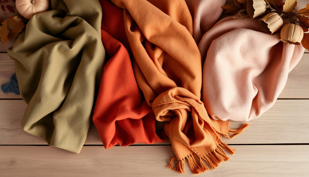
Soft Autumn Color Palette: Colors to Wear and Avoid
Few personal style discoveries feel as satisfying as finding the one color palette that makes everything click. If you’ve ever held up a dusty rose sweater next to your face and noticed your skin looked instantly brighter, you might already be a soft autumn. This guide walks through the muted, warm palette that defines this season — from identifying your undertones to building a wardrobe that genuinely works.
Typical Soft Autumn undertones: warm, muted, low contrast · Core palette characteristic: low chroma with warmth · Common confusion season: Soft Summer (cooler, similar mutedness) · Key avoid color family: bright, icy, or stark cool tones
Quick snapshot
- Warm, muted undertones (Gabrielle Arruda (seasonal color analysis guide))
- Low contrast between hair, eyes, and skin (The Concept Wardrobe (color analysis authority))
- Hair often mousy blonde, light brown, or warm auburn (Gabrielle Arruda (seasonal color analysis guide))
- Dusty rose, olive green, warm taupe, muted orange (Style with DC (style and color consultancy))
- Low chroma means colors look soft, smoky, or dusty (Four Seasons Studio (seasonal color analysis guide))
- No bright or icy tones (Style with DC (style and color consultancy))
- Dark brown, warm charcoal, greige, khaki (Agile Styling (personal styling resource))
- Camel, cream, warm white (Agile Styling (personal styling resource))
- Black, pure white, bright blue, hot pink (YouTube: SOFT AUTUMN COLOR PALETTE (color analysis breakdown))
- Lemon yellow, icy pastels, cool greys (YouTube: SOFT AUTUMN COLOR PALETTE (color analysis breakdown))
The pattern across all four dimensions: soft autumn is defined by muted warmth and medium value.
| Attribute | Soft Autumn Characteristic |
|---|---|
| Dominant undertone | Warm (yellow, peach, golden) (Gabrielle Arruda (seasonal color analysis guide)) |
| Chroma level | Low (muted, soft) (Four Seasons Studio (seasonal color analysis guide)) |
| Value range | Medium (not too light, not too dark) (Gabrielle Arruda (seasonal color analysis guide)) |
| Best metal | Gold, bronze, copper (The Concept Wardrobe (color analysis authority)) |
How do you know if you are a soft autumn?
Key physical traits of soft autumns
- Muted hair — often mousy blonde, warm brown, or soft auburn (Agile Styling (personal styling resource))
- Skin with yellow or peach undertones, not pink
- Eyes with soft flecks — hazel, gray-blue, or warm brown (The Concept Wardrobe (color analysis authority))
- Overall low contrast: hair, skin, and eyes sit at similar depth levels
A soft autumn who wears a bright icy pink doesn’t just clash — the mismatch creates a visible disconnect between the color and the skin’s muted undertone, making the face look sallow or washed out. That’s because the palette is built on harmony, not contrast.
Color characteristics of the soft autumn season
- Low chroma — colors are softened with gray, not black or white (Four Seasons Studio (seasonal color analysis guide))
- Warm primary aspect — even blues are softened to muted teal (Style with DC (style and color consultancy))
- Medium value — neither very light nor very dark (Gabrielle Arruda (seasonal color analysis guide))
The pattern: soft autumn is the palest, most delicate member of the autumn family. Colors look like autumn leaves that have been dusted with ash — still warm, but never loud. The trade-off is that this subtlety makes it harder to identify than high-contrast seasons, but once recognized, it explains why certain clothes always feel “right” and others never do.
What colors should a soft autumn avoid?
Worst colors for soft autumn
- Pure black — too harsh; dark charcoal or deep brown is a better neutral (YouTube: SOFT AUTUMN COLOR PALETTE (color analysis breakdown))
- Pure white — opt for cream or warm ivory
- Electric blue, bright fuchsia, neon pink — all too high in chroma (Four Seasons Studio (seasonal color analysis guide))
- Lemon yellow — too bright; try mustard or muted gold instead
Soft autumn vs. black and white
- Black overpowers the soft autumn’s muted quality; it creates a harsh line rather than harmonious flow
- White, especially cool white, drains warmth from the face
- Best alternatives: dark brown, warm charcoal, cream, and off-white (Style with DC (style and color consultancy))
A small black accessory — like a leather handbag — may still work if the rest of the outfit is in the soft autumn palette. The risk is that black near the face draws the eye to the contrast rather than the person.
The implication: every color decision for a soft autumn comes down to chroma management. A color’s saturation is more important than its hue. Even a warm color like orange can fail if it’s too bright.
Can a soft autumn wear dark grey?
Grey tones that work for soft autumn
- Greige — grey with a brown undertone, one of the most reliable soft autumn neutrals (Agile Styling (personal styling resource))
- Charcoal with a warm cast — looks like storm clouds tempered by earth
- Mushroom grey — pale, warm, and muted
Grey tones to avoid
- Cool, blue-toned greys — clash with the warm undertone (The Concept Wardrobe (color analysis authority))
- Steel grey — too cool and stark
- Silver grey — often reads as icy against warm skin
What this means: dark grey is not forbidden — it just has to lean warm. If you hold a grey fabric next to your face and it makes your skin look grayish or flat, the grey is too cool.
Can a soft autumn wear silver?
Metallics for soft autumn
- Gold — the strongest metal choice, especially brushed or matte finishes (The Concept Wardrobe (color analysis authority))
- Bronze and copper — excellent for jewelry, watch cases, and belt buckles
- Antique or matte silver — possible if the finish is subdued enough (The Concept Wardrobe (color analysis authority))
Silver vs. gold for soft autumns
- Gold is the default for a reason — it echoes the warm undertone
- Shiny, bright silver should be avoided; it introduces coolness and shine that compete with the muted palette
- If silver is a preference, pair it with warm clothing tones — a silver necklace against a camel sweater balances the coolness (The Concept Wardrobe (color analysis authority))
The trade-off: silver can work as an accent, but the softer autumn’s features are warm-toned, and warm metals naturally harmonize. Gold is the safer choice for everyday wear; silver requires intentional styling to pull off.
Can a soft autumn wear navy?
Navy shades that flatter soft autumn
- Teal-navy — navy with a greenish undertone that blends warm and deep (Style with DC (style and color consultancy))
- Dusty navy — muted enough to sit within the low-chroma spectrum
- Brown-navy — navy with a brownish cast, uncommon but excellent for soft autumn
Navy vs. other dark blues
- Cool, bright navy (typical in formal suits) is too harsh
- Deep blue-gray can work if it leans warm
- Royal navy — far too saturated (Four Seasons Studio (seasonal color analysis guide))
The pattern: navy can be a soft autumn neutral, but only the right navy. The most reliable test — compare the navy to a true autumn brown. If they feel related rather than opposing, it will work.
What are the worst colors for soft autumn?
High-contrast colors to avoid
- Bright white and black — the most extreme offenders (YouTube: SOFT AUTUMN COLOR PALETTE (color analysis breakdown))
- Electric blue — high chroma and cool, doubling the mismatch
- Hot pink and fuchsia — too bright and too cool simultaneously
- Lemon yellow — saturated warmth that still fails because it’s too intense
Cool pastels to skip
- Baby blue — icy and cool, drains warmth
- Bubblegum pink — high chroma pastel that fights muted skin
- Lavender — too cool; soft autumn can wear muted mauve instead
A soft autumn who consistently wears cool pastels or bright neons is fighting her own features. The colors don’t just look off — they actively make skin look sallow, tired, or gray. The solution is not to abandon color but to swap chroma: replace baby blue with dusty teal, replacing hot pink with dusty rose.
Why this matters: worst colors for soft autumn share two traits — high saturation and/or cool undertone. Once you see that pattern, the specific hue matters less than its intensity and temperature.
What color is replacing grey in the soft autumn palette?
2026 color trends for home and fashion
- Warm neutrals — greige, warm beige, soft mushroom — are replacing cool grey in interior design
- For fashion, the soft autumn palette already favors warm taupes, browns, and olive tones over grey
- Earth tones are gaining momentum in both home and apparel categories
Warm neutrals gaining popularity
- Greige (grey + beige) is the most direct warm-neutral replacement for cool grey
- Cocoa brown — deeper and richer than traditional brown
- Soft olive — a green-based neutral that works across the soft autumn palette (Agile Styling (personal styling resource))
The catch: grey isn’t being replaced by a single color — it’s being replaced by a warmer, earthier approach to neutrals. For soft autumn, this is good news. The palette was always built around muted warmth, and the broader trend is finally catching up.
Steps: Build a soft autumn capsule wardrobe
- Start with base neutrals. Choose two to three warm neutrals — dark brown, warm charcoal, and camel. These form the foundation of every outfit. (Agile Styling (personal styling resource))
- Add muted accent colors. Dusty rose, olive green, and muted orange are versatile accent colors that can be used in tops, scarves, or accessories. (Style with DC (style and color consultancy))
- Choose texture over shine. Suede, matte cotton, cashmere, and linen work better than glossy synthetics or wet-look fabrics. (Agile Styling (personal styling resource))
- Select one metal for jewelry. Gold, bronze, or copper — whichever you prefer, wear it consistently. Mixed metals work if both are warm-toned. (The Concept Wardrobe (color analysis authority))
- Test each purchase against your face. Hold the fabric under your chin in natural light. If your skin looks brighter and your eyes clearer, the color works. If you look gray or sallow, it doesn’t.
A wardrobe that’s 100% soft autumn colors can feel monochromatic. The fix: play with texture and value. Pair a dark chocolate sweater with olive pants and a cream scarf — all soft autumn, all visually interesting because of contrast in depth and surface texture.
Summary
The soft autumn palette is not about restriction — it’s about precision. Every color you choose either harmonizes with your natural warmth and mutedness or fights it. For anyone building a wardrobe from this season, the choice is clear: lean into dusty rose, olive, warm taupe, and muted gold, or keep buying colors that never quite feel right.
For a deeper dive into the specific shades and celebrity examples, check out this complete guide to the soft autumn palette.
Frequently asked questions
Can soft autumn wear olive green?
Yes. Olive green is one of the core soft autumn colors. It is muted, warm, and medium in value — a perfect fit. (Gabrielle Arruda (seasonal color analysis guide))
What is the difference between soft autumn and true autumn?
True autumn has pure, deep colors like emerald and navy with higher saturation. Soft autumn is the muted version — colors are dusted with gray, creating lower contrast and a softer overall effect. (YouTube: SOFT AUTUMN COLOR PALETTE (color analysis breakdown))
Is soft autumn the same as muted autumn?
Yes. Soft autumn is also called muted autumn in some systems. The key characteristic — low chroma with warmth — remains the same. (Four Seasons Studio (seasonal color analysis guide))
Can soft autumn wear pastels?
Not typical pastels like baby blue or bubblegum pink. But muted pastels — dusty rose, soft peach, warm lavender — can work if they are low in chroma and warm in undertone.
What lipstick colors suit a soft autumn?
Earth rose, muted cinnamon, brown-based nudes, and russet. Satin or matte finishes are preferred over glossy. (Dream Wardrobe (color analysis blog))
Does soft autumn suit black and white stripes?
Typically no, because the high contrast of black and white stripes clashes with the soft autumn’s low-contrast features. A cream and dark brown stripe would be more flattering.
How do I transition my wardrobe from soft summer to soft autumn?
Shift from cool pastels and silver to warm neutrals and gold. Replace baby blue with dusty teal, pink with dusty rose, and cool grey with greige or warm taupe. (Agile Styling (personal styling resource))
Related reading
More related posts
 The Andy Griffith Show: End, Cast, and Streaming Guide
 Fantastic Four Post-Credit Scene: Doom, Galactus & Franklin
 Jason Statham New Movie: Shelter 2026, Mutiny & Wrath of Man
 Matlock (2024) Episodes: Season 1 & 2 Guide
 Will Trent Season 4: Release Date, Cast, Episodes, Where to Watch
 SCDCA Warns Data Breach – How to Claim Free Credit Monitoring
 South Korea Submarine Offer to Canada: $42B Bid Details
 Are Bananas Good for Dogs? Benefits, Risks, and Serving Guide